
Statistics – Overview
Description
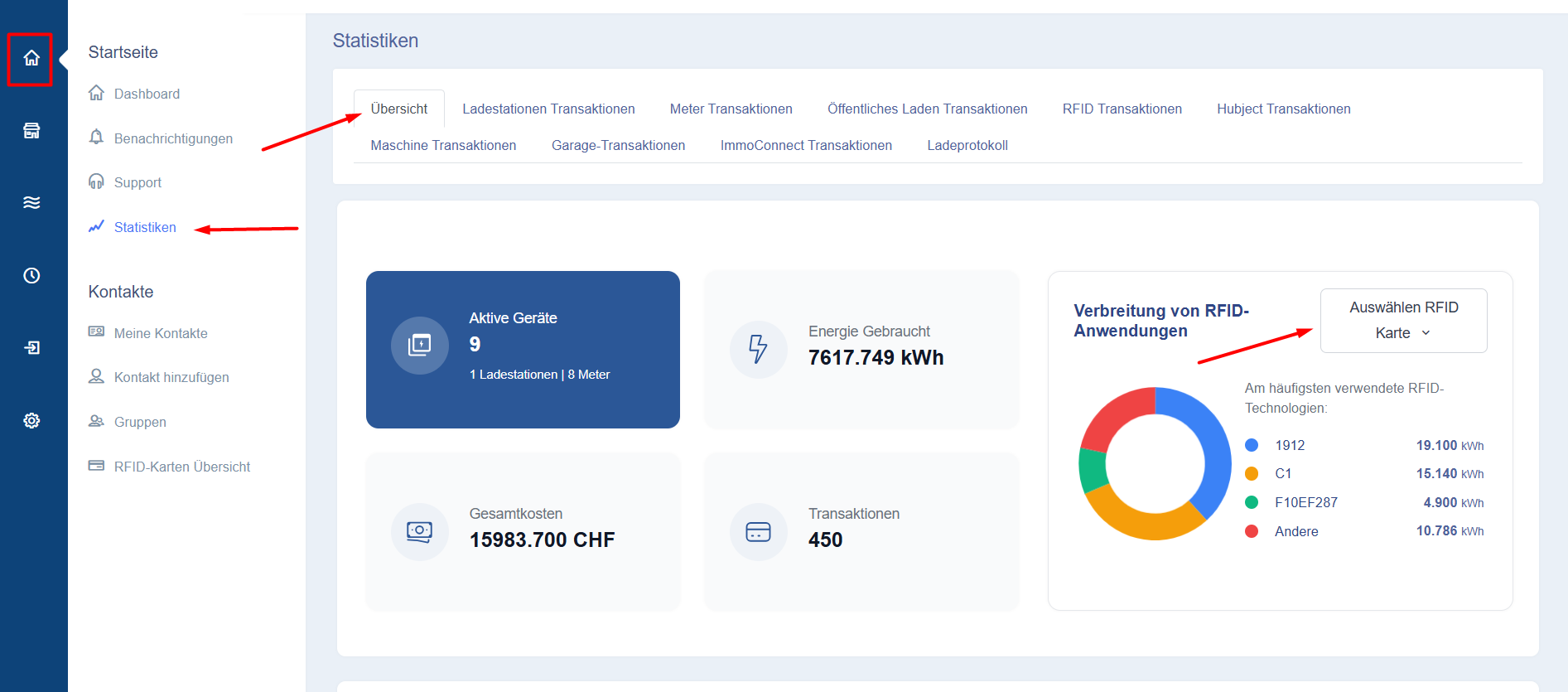
The overview page is the main dashboard of the statistics module and serves as the starting point for analysing all charging and energy-related activities within the Eponet platform. Rather than displaying individual transactions, this page provides a summarised overview of the key statistics for your account, allowing users to quickly grasp overall performance without having to work their way through detailed reports.
The dashboard combines information from various areas of the platform, including charging points, meters, RFID cards, charging sessions and energy consumption. It is designed to provide administrators and facility managers with an immediate overview of operational activities, making it easier to monitor the infrastructure, identify usage trends and detect unusual behaviour patterns.
When you select a different time period, all displayed values, graphs and charts are automatically recalculated so that only data within the selected date range is taken into account.
The ‘Overview’ page should be used whenever you need a quick overview of your charging infrastructure before viewing detailed transaction reports.
Navigation
To access the Overview page:
-
Open the Eponet portal.
-
Select ‘Statistics’ from the left-hand navigation menu.
-
The ‘Overview’ tab will open automatically.
-
If another statistics page is currently open, simply click on ‘Overview’ in the top navigation bar.
Purpose of the Overview Dashboard
The Overview dashboard is designed to answer the most common questions users have when reviewing their billing activity, such as:
-
How many devices are currently linked to my account?
-
How much energy has been consumed during the selected period?
-
How many charging sessions have been completed?
-
What are the total charging costs?
-
Which RFID cards are used most frequently?
-
Are my chargers being actively used?
Instead of checking hundreds of charging sessions individually, the dashboard presents this information in a visual and easy-to-understand format.
Understanding the dashboard layout
The overview page is divided into several sections.
-
Overview cards
-
Distribution of RFID usage
-
Date range filters
-
Navigation tabs
Each section offers a different perspective on your charging activities.
Active devices
The ‘Active Devices’ tab displays the total number of devices currently linked to your account.
Depending on your setup, these devices may include:
-
Charging points
-
Meters
As well as the total number of registered devices, the dashboard also shows how many of these devices are currently online and actively communicating with the Eponet platform.
Using this information, administrators can quickly check the operational status of their infrastructure.
Energy consumption
The ‘Energy consumption’ map displays the total amount of energy registered on the Eponet portal that has been supplied up to the current date.
The value is displayed in kilowatt-hours (kWh) and includes all completed charging processes that match the selected filters.
This KPI helps users understand how much electricity has been consumed over time.
Total costs
The ‘Total Costs’ card displays the total value of all charging sessions you have paid for.
The amount displayed is calculated automatically from the completed charging sessions and reflects the prices configured in your Eponet installation.
Depending on your configuration, the amount may include the following:
-
Energy costs
-
Fixed charging fees
-
Eponet service charges
This dashboard is particularly useful for finance teams and administrators who regularly review operational charging costs.
Note: If you have authorised chargers without a charging profile (free chargers), this amount will be significantly lower, as most charging sessions were free of charge.
Total number of transactions
The ‘Transactions’ tab shows the total number of completed charging sessions.
Each successfully completed charging session is counted as one transaction.
By monitoring transaction figures, administrators can quickly gauge charger utilisation without having to view detailed reports.
Distribution of RFID usage
One of the most useful visual elements on the overview page is the chart showing the distribution of RFID usage.
This chart illustrates how charging operations are distributed across the various RFID cards or RFID technologies.
Each section of the chart represents a different RFID card or user.
Depending on your installation, the chart may display the following:
-
Total number of top-ups
-
Total energy
-
Percentage of total usage
This enables administrators to determine the following:
-
Frequently used RFID cards
-
Shared card
usage
Navigate to the detailed reports
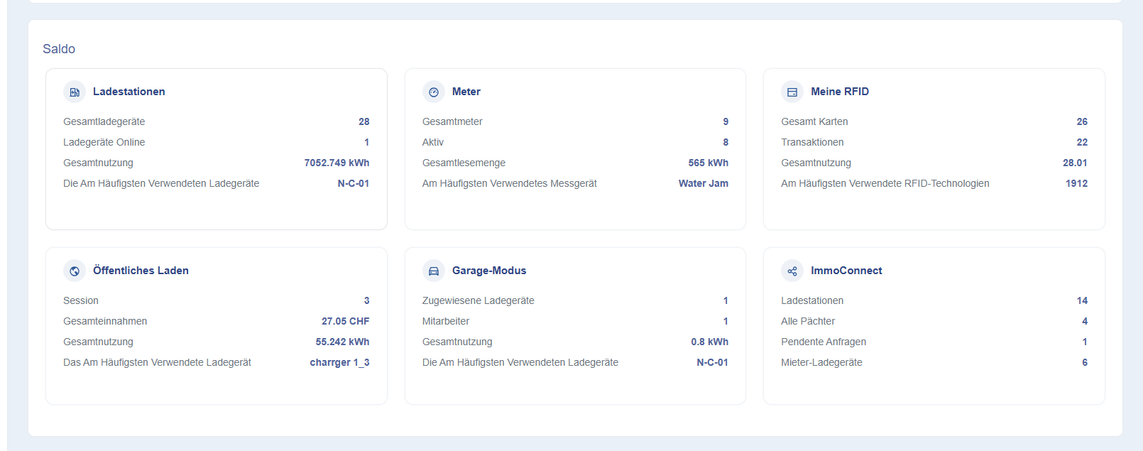
The overview dashboard provides a summary of your billing activities. For detailed information, users can switch to the other tabs under ‘Statistics’.
Examples of these include:
-
Charging point transactions for individual charging sessions.
-
Meter transactions relating to energy consumption.
-
RFID transactions for analysing charging sessions carried out using RFID cards.
-
Transactions at public charging points to review revenue from public charging.
-
Hubject transactions for analysing roaming sessions.
-
Charging log for information on technical events.